Mastering HubSpot Reporting for Powerful Insights


HubSpot is a versatile tool that offers deep data insights for businesses. With the HubSpot CRM platform, you can conveniently access all your data in one place, gaining a comprehensive understanding of your business performance on the go. It also simplifies app integration, allowing you to measure, monitor, and report on your essential data within HubSpot, without the hassle of plugin management. Mastering the process of collecting, analyzing, and interpreting complex data will help you drive growth and boost revenue across your business.
Why Your Business Needs a Data-Driven Approach
Data plays a crucial role in every aspect of your organization. Whether it's lead generation, customer care, or internal communication, effective data analysis enables you to make informed decisions based on information rather than intuition or fragmented observations. By leveraging data-driven decision-making, you can anticipate your customers' needs even before they communicate them. This ability to see into the future is invaluable for enhancing customer experiences.
Predicting customer behaviour empowers you to provide a seamless buying journey, adding value to every interaction. When customers are delighted with your service, they become loyal advocates who share their positive experiences with others, online and offline. On the other hand, failing to meet customer expectations can have disastrous consequences, with customers disengaging from companies that bombard them with irrelevant promotions or messaging.
To ensure customer satisfaction and make confident decisions, you need a wealth of data. With readily available information about your target audience, you can personalize and optimize every stage of the customer journey. By researching and analyzing factors such as behavior prediction, best-fit prospects, user research, industry trends, and more, you can gain valuable insights and take strategic actions.
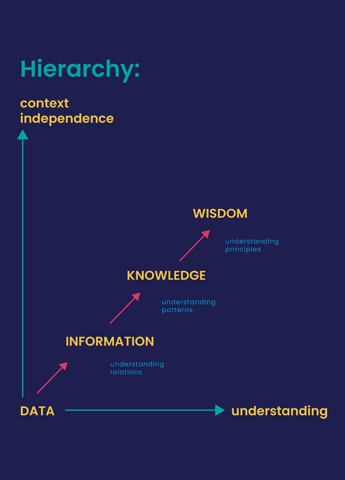
Understanding the DIKW Model
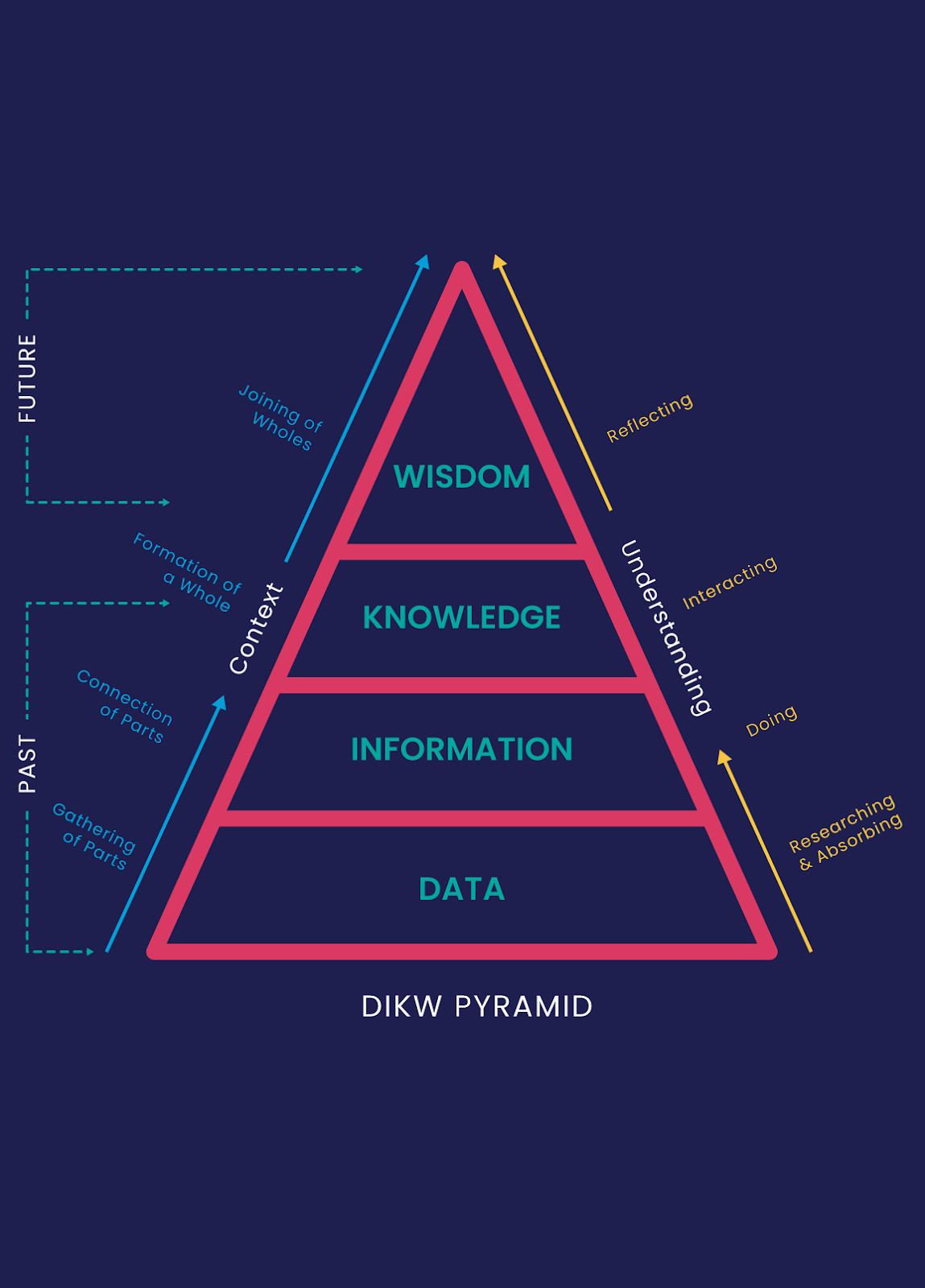
The DIKW model outlines the process of transforming data into information, knowledge, and wisdom, ultimately leading to actionable insights and decisions. By contextualizing and understanding data, businesses can extract value from various data types and take action with that information.
The DIKW process involves gathering data (D), connecting data to create information (I), consolidating information to form knowledge (K), and combining knowledge to generate wisdom (W). This model consists of context and understanding. In the context perspective, the model moves from gathering parts (data) to connecting parts (information), forming a whole (knowledge), and merging wholes (wisdom). In the understanding perspective, the model represents a process of researching, absorbing, doing, interacting, and reflecting.
Insights and Actionable Steps from Data
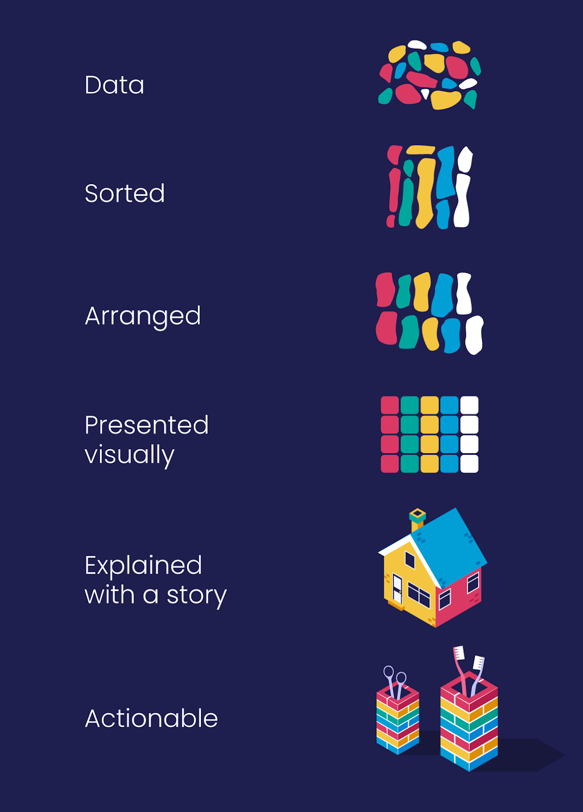
To gather useful insights from data, you need clear reports displayed in an easy-to-understand format. Presenting data as a story, with context and meaningful connections, helps you communicate effectively. Reports should provide a cohesive narrative, explain results, and identify actionable steps for improvement.
Storytelling with Data
Effective data presentation involves more than simply displaying graphs on a dashboard. Data visualization should be used to weave a meaningful story by providing context and explaining the reasons behind the results. The goal is to add value to the data by sharing insights and potential actions rather than shaping a narrative to suit specific objectives. Poor results should be presented in context, with a focus on understanding what happened and finding ways to improve or mitigate the issues identified. By following the DIKW model, you can share results, highlight relevant circumstances, and offer insights for future actions.
HubSpot Reporting Tools
HubSpot provides a range of reporting tools to support businesses in tracking and analyzing their data effectively. These tools offer comprehensive reports across different areas of your business, enabling you to gain insights and measure performance.
The reporting tools available within HubSpot include in-tool reports, analytics tools, custom reports for single objects, custom reports builder, funnel reports, contact attribution reports, deal create attribution reports, and revenue attribution reports.
Building Impactful Dashboards
When creating data dashboards, it is crucial to consider their purpose and the problem they aim to solve. Avoid creating dashboards without a clear need, as it can waste time and resources. Identify the metrics that are most important to your target audience and ensure your dashboard provides insights that align with their objectives.
Designing an effective dashboard involves distributing content on the page in a layout that is easy to navigate. Break up text into short paragraphs and bullet points for skimmability. Maintain a simple and uncluttered layout with sufficient white space for readability. Use informative headings and subheadings to guide users through the dashboard and create a consistent design throughout. Make use of color, font size, and contrast to highlight key information and maintain a clear text hierarchy. Incorporate your branding elements for a cohesive design, and consider using visualizations such as bar charts, line charts, and pie charts to present data.
Continuously evolve your dashboards based on feedback and changing goals. Regularly review the metrics that resonate with your team and those that provide the most value. Strive for consistency in design, clarity of communication, and the ability to drive actionable insights.
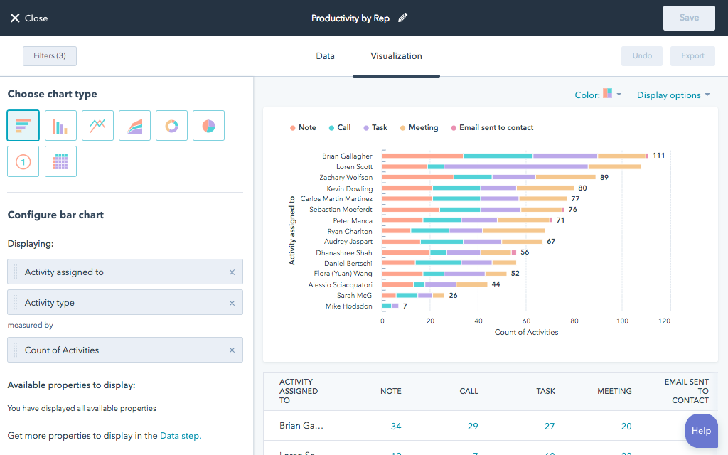
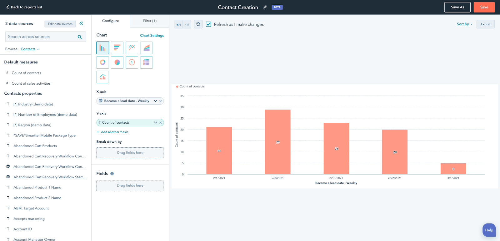
Building Custom Reports
HubSpot's custom reports enable you to dive deeper into the details and analyze specific data sets. These reports allow you to compare activities, analyze various objects and integrations, and gain a comprehensive understanding of your data sources in one place. By leveraging custom reports, you can save time and effort by eliminating the need to join data manually in external tools.
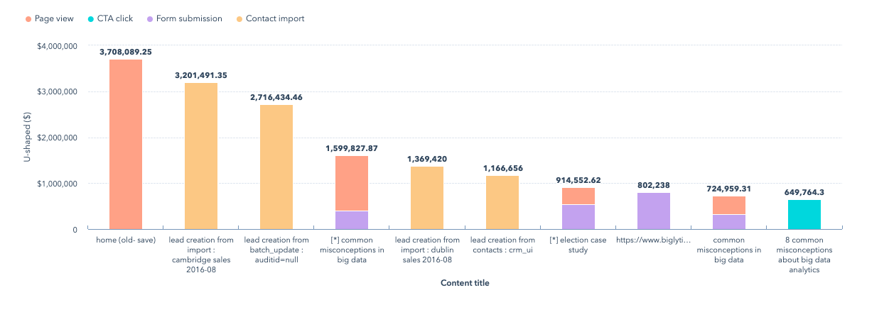
When building a custom report in HubSpot, ensure you have the required data set, properties, filters, and visualization options in place. Once created, you can save and export the report for future reference. See some examples of reports available below.
Custom Reports: Single Object
Analyze contacts, companies, deals, tickets, custom objects, activities, line items, or feedback submissions.
Custom Reports Builder
An advanced report builder that enables you to analyze objects concerning marketing, sales, and service activities.
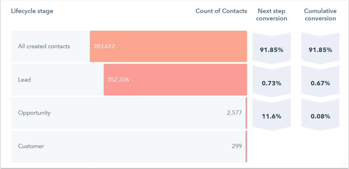
Funnel Reports
Measure the conversion rates between certain stages in a customer's lifecycle or deal's pipeline. If you have an Enterprise subscription, you can also create a custom events funnel.
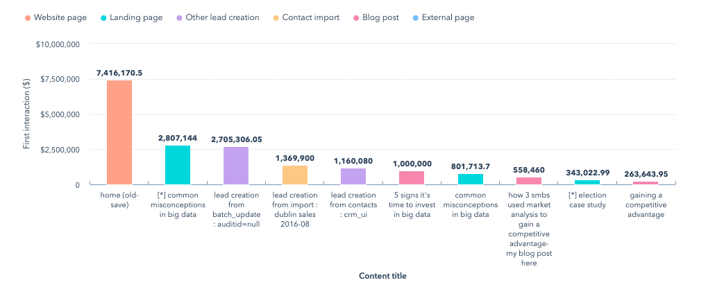
Contact attribution report
Measure which sources, assets, and interactions impacted lead generation (Marketing Hub and CMS Hub Enterprise only).
Deal create attribution reports
Measure which sources, assets, and interactions impacted deal generation (Marketing Hub Enterprise only).
Deal create attribution reports
Measure which sources, assets, and interactions impacted deal generation (Marketing Hub Enterprise only).
For help building custom reports, use this guide from HubSpot or get in touch with us.
Choosing the Right Chart Types
Choosing the right chart types is a critical aspect of data visualization. It allows you to present your data in a way that effectively communicates the intended message and insights. Different chart types are designed to highlight specific aspects of your data, such as comparisons, composition, distribution, trends, or relationships. Here's a closer look at the different considerations for selecting the appropriate chart type:
- Comparing Values: When you need to compare values, it's important to choose chart types that emphasize the differences or similarities between data points. Common chart types for comparisons include:
-
Column Chart: Ideal for comparing categories and their respective values. It shows the height of the columns to represent the values accurately.
-
Bar Chart: Similar to a column chart but with horizontal bars. It is useful when the labels for the categories are long, and you want to save space.
-
Mekko Chart: Also known as a Marimekko or mosaic chart, it combines column and stacked bar charts to display data in both width and height. It is effective for comparing values across multiple dimensions simultaneously.
- Showing Composition: When you want to show how individual parts contribute to the whole, chart types that display composition are the most suitable. These charts highlight the proportion or percentage distribution of different categories. Common chart types for composition include:
-
Pie Chart: Represents parts of a whole as wedges of a circle, with each wedge representing a category and its proportionate value.
-
Stacked Bar Chart: Displays multiple categories as stacked bars, with each segment representing a different component or subcategory. It shows the relationship between the parts and the total.
-
Mekko Chart: As mentioned earlier, a Mekko chart can also be used to show composition by representing the relative width of each category.
- Understanding Distribution: When you want to analyze the distribution of your data, it's essential to choose chart types that reveal patterns, variations, and outliers. These charts help identify the central tendency, spread, and shape of your data. Common chart types for understanding distribution include:
-
Scatter Plot: Displays individual data points as dots on a two-dimensional grid. It helps identify relationships and patterns between two variables.
-
Mekko Chart: While primarily used for comparisons and composition, a Mekko chart can also provide insights into the distribution by representing the width of each category based on its proportion.
-
Line Chart: Plots data points connected by lines, allowing you to observe trends, changes over time, or patterns in continuous data.
-
Column Chart or Histogram: A column chart can be transformed into a histogram by arranging data into bins or intervals. It provides a visual representation of the frequency or count of data within each bin.
- Analyzing Trends: When you want to track changes and analyze trends over time or across different categories, specific chart types are particularly useful. They help identify patterns, growth, or decline in your data. Common chart types for analyzing trends include:
-
Line Chart: As mentioned earlier, a line chart is effective for showing trends and changes over time. It visually connects data points, allowing you to identify patterns or fluctuations.
-
Dual-Axis Line Chart: This chart type combines two line charts with different scales on the y-axis. It allows you to compare two variables with distinct units of measurement and observe their trends.
-
Column Chart: When comparing values across different categories over time, a column chart with grouped or stacked columns can be used to highlight trends and variations.
- Demonstrating Relationships: When you want to explore the relationships between variables, chart types that visualize correlations, associations, or dependencies are crucial. They help identify connections and dependencies between data points. Common chart types for demonstrating relationships include:
-
Scatter Plot: As mentioned earlier, a scatter plot displays the relationship between two variables, helping identify patterns and correlations.
-
Bubble Chart: Similar to a scatter plot, a bubble chart adds an additional dimension by representing a third variable through the size of the bubbles. It enables visualization of relationships among three variables.
-
Line Chart: In some cases, line charts can also demonstrate relationships between variables, particularly when one variable influences or affects the other.
By considering the purpose of your data visualization and the insights you want to convey, you can select the most appropriate chart type to effectively communicate your message. Remember to choose the chart type that best represents your data and helps your audience understand the information you are presenting.
Leverage best practices
HubSpot reporting can help you gain powerful insights, drive growth, and make data-driven decisions. Understanding your data, building impactful reports and dashboards, and choosing the right chart types are key steps in maximizing the value of your data. Let our team of experts assist you in harnessing the full potential of HubSpot reporting to propel your business forward. Contact us today to get started.
Data Insights for Business Growth
Ready to unlock the full potential of HubSpot reporting? Our team of experts is here to help you build impactful campaigns, insightful reports, and data-driven strategies. Contact us today to get started on maximizing your business growth with HubSpot.

.png)

Katrina Thunem
Katrina has worked with clients all over the world at some of the largest international marketing and advertising agencies. Katrina excels at inspiring, organizing, and executing creative digital marketing campaigns that harness the power of today's technology.